Research & Discovery
I conducted comprehensive research to understand user needs, pain points, and expectations when interacting with loyalty programs in mobile applications.
User Research
We conducted interviews with 18 active InPost app users across different demographics to understand their experiences with the loyalty program and rewards section.
Key Research Insights
InPost parcel lockers are the most popular form of delivery and return in Poland
Market dominance in delivery preferences
Users are primarily motivated by saving money, simple rules, and quick reward collection
Key drivers for program participation
Cash rewards are most desirable due to their universal appeal and ease of use
Preferred reward type
Main barriers: complicated rules, information chaos, and inappropriate rewards
Key participation obstacles
Positive experiences and good customer reviews strongly influence loyalty
Customer retention factors
Users Reviews
Jan Kowalski
2 days agoSoo... instead of catching competition [...] you add some loyalty program, Allegro is outrunning you!
Maria Nowak
1 week agoThe new icons for purchases and rewards look bad. I understand that they were probably meant to be vintage style, but they don't fit with the rest.
Adam Wiśniewski
3 days agoThe new app works very poorly. It is unintuitive and incomparably worse than the previous one.
User Persona
Monika M
32 years old • Marketing Manager
Warsaw, Poland
Bio
A busy marketing manager balancing work and personal life. Lives in a metropolitan area and frequently shops online for both professional and personal needs. Values efficiency and smart solutions that help her manage time better.
Behavior
- • Orders online 3-4 times per week
- • Prefers mobile apps over websites
- • Uses InPost lockers for 80% of deliveries
- • Checks delivery status multiple times per day
Motivations
- • Saving time and avoiding queues
- • Getting the best value for money
- • Being rewarded for loyalty
- • Having control over delivery process
Goals
- • Efficiently manage deliveries
- • Save money on shipping costs
- • Minimize time spent on logistics
- • Access deliveries 24/7
Pain Points
- • Complex loyalty programs
- • Unclear reward systems
- • Time-consuming redemption process
- • Difficulty tracking points and benefits
Personality Traits
Customer Journey Map
Key Journey Insights
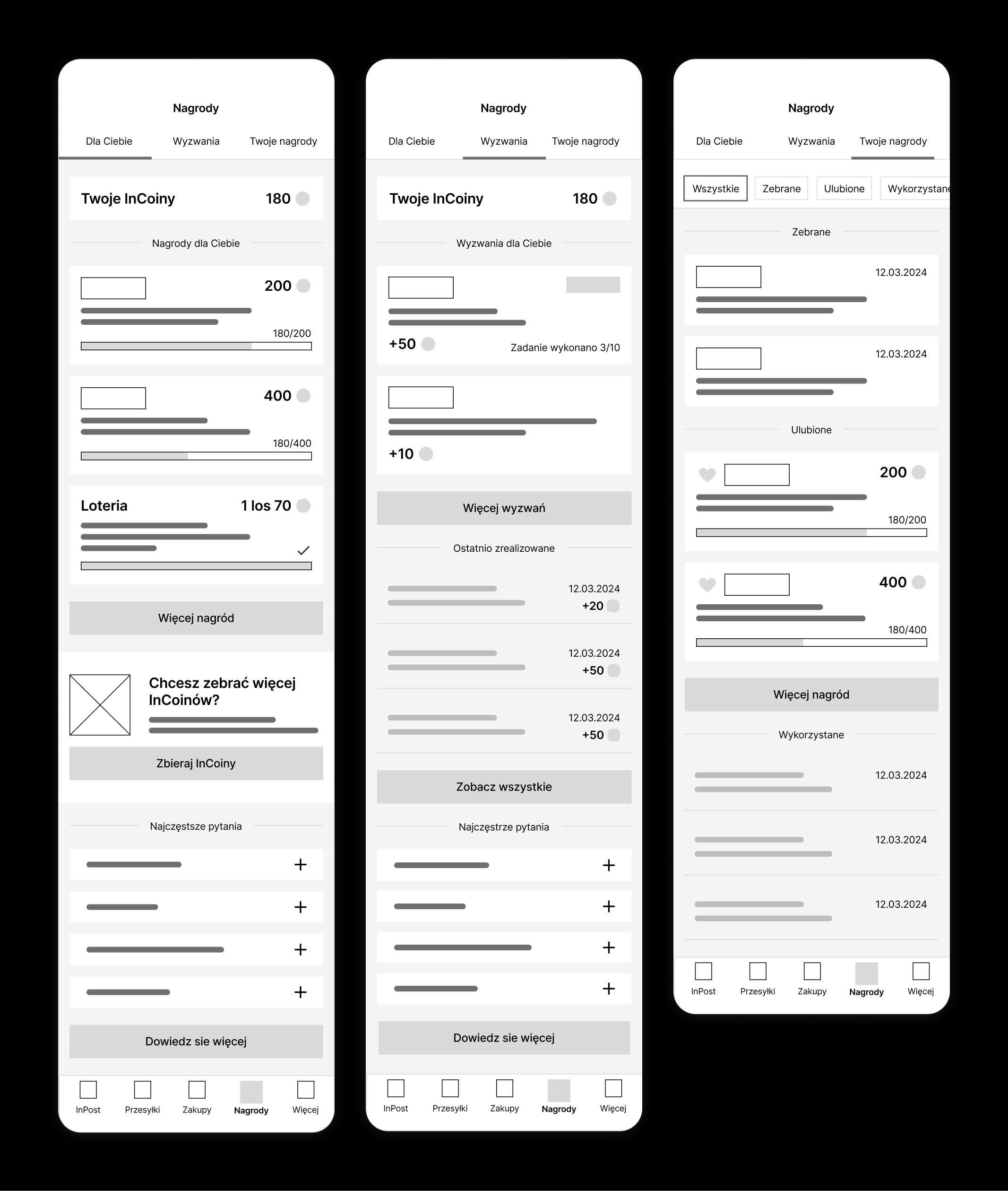
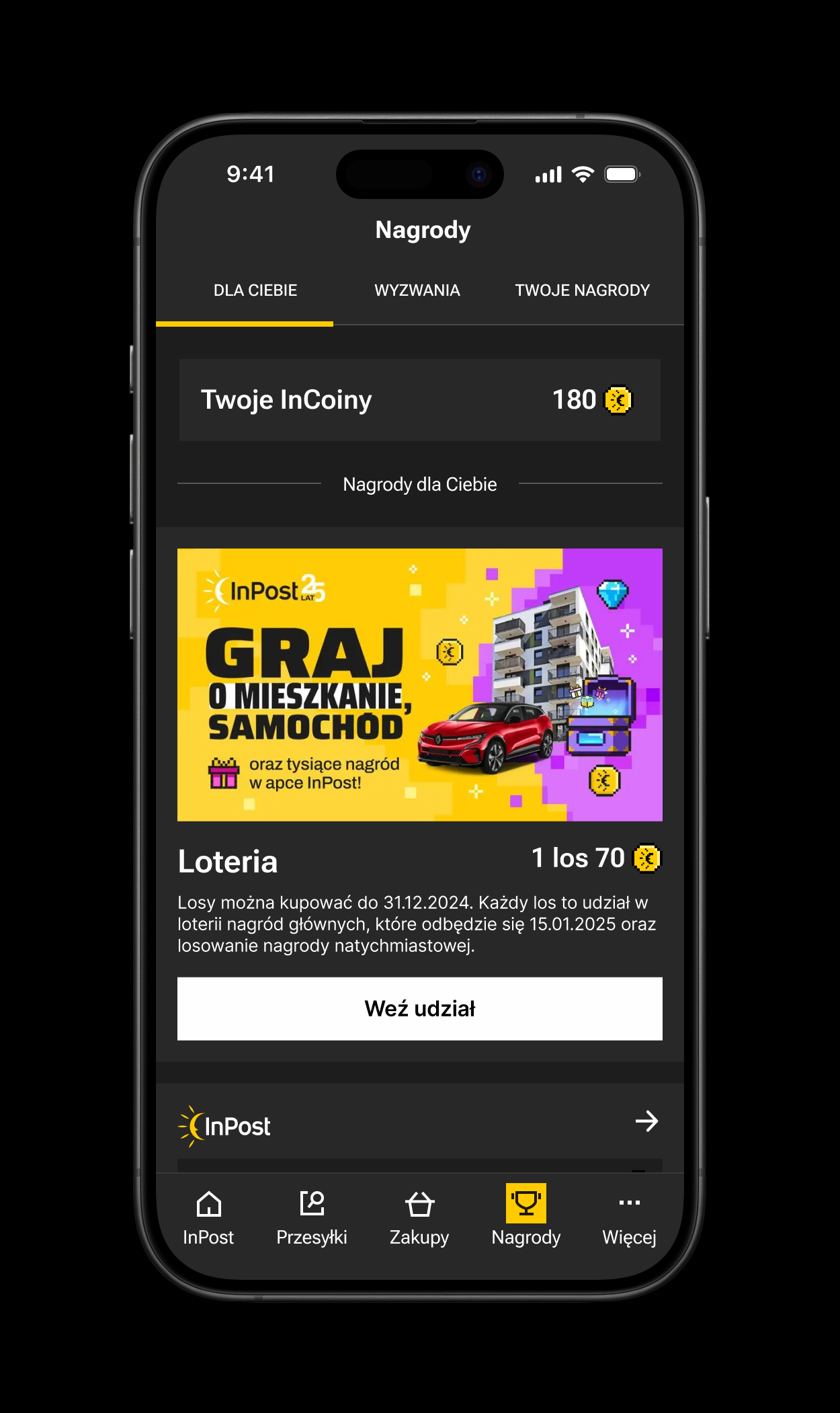
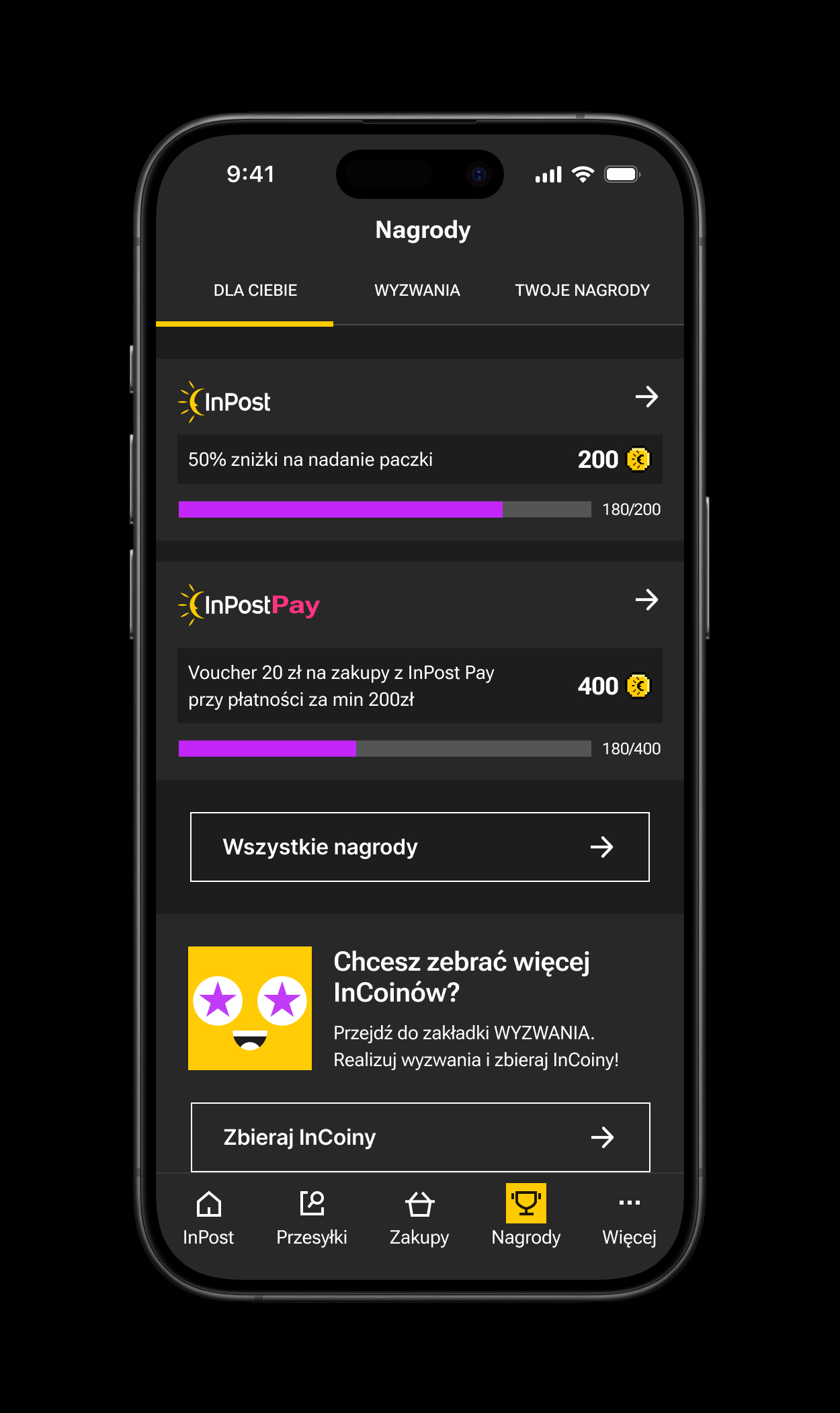
Key screens from the InPost app described in the most important points of the customer journey map
Pain Points
-
Misleading messages about lottery participation and prize eligibility
-
No visibility of current InCoins balance while browsing prizes
-
Lack of system status feedback (lottery end, insufficient coins)
-
No error prevention for code copying before proceeding
Opportunities
-
Providing the user with key information and presenting real-time status updates
-
Comparing the number of Incoins needed to receive a reward with the number of Incoins currently held
-
Display persistent InCoins balance across all relevant screens
-
Add confirmation steps and warnings for critical actions
Critical Touchpoints for Improvement
System Status
Provide clear, real-time feedback about program status and user eligibility
Error Prevention
Implement safeguards and confirmations for critical user actions
Balance Visibility
Maintain consistent display of InCoins balance throughout the journey
Benchmarking Analysis
Notable Solutions to Adopt
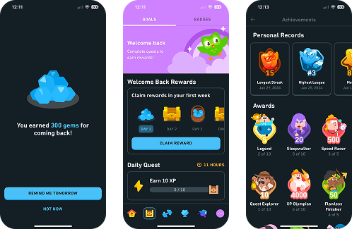
Duolingo's Reward System
Instant points notifications, upfront prize display, immediate reward collection, and clear progress tracking towards goals.
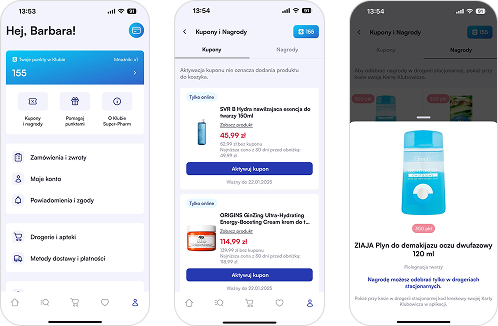
Super-Pharm's Interface
Highlighting of points collected, simple structure and navigation, clear messages throughout the experience.
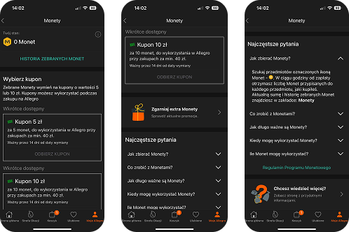
Allegro's Coins System
Clear rules for coin-to-coupon exchange, prominent "Get extra coins" section below coupons, integrated FAQ section, and easy access to detailed information.