National Geoportal Redesign
National Geoportal Redesign
Transforming complex spatial data into an accessible and user-friendly interface for citizens and officials.
GUGIK (Head Office of Geodesy and Cartography)
6 months
UX/UI Designer
Project Overview
The National Geoportal is one of the most popular public administration services in the country, providing citizens and officials with access to crucial spatial data. GUGIK, the organization responsible for managing this data, decided to visually refresh the system and increase its transparency.
Due to the institutional nature of the project, I worked under limited research conditions—without access to analytical data or end-user groups. This meant designing "from the top," focusing primarily on client expectations rather than direct user needs. Despite these constraints, I strived to incorporate good UX practices wherever possible, creating interfaces that were more intuitive, readable, and accessible.
Stakeholder Goals
-
Client: Create a "WOW effect" and expand functionality at low cost
-
Product Owner: Develop a flexible, clean layout for future projects
-
Developers: Implement a responsive Vaadin-based layout
-
Regular Users: Maintain familiar principles to avoid relearning
-
New Users: Provide quick access to needed functionality
My Role & Responsibilities
-
Analysis and Planning
Analyzed client requirements and established main project objectives, adapting tools and strategies to project requirements and constraints.
-
New Layout
Restructured the portal's information hierarchy to balance institutional requirements with improved usability.
-
UX/UI Design
Created wireframes, prototypes, and high-fidelity designs for the portal interface, focusing on clarity and accessibility.
-
Developer Collaboration
Worked closely with the development team to ensure design implementation was technically feasible within the Vaadin framework.
Project Challenges
Limited User Research
No access to end-users or analytics data meant designing based on stakeholder assumptions rather than validated user needs.
Conflicting Stakeholder Goals
Balancing the client's desire for visual impact, the product owner's need for flexibility, and users' need for familiarity.
Technical Constraints
Working within the limitations of the Vaadin framework and existing backend systems while delivering modern UI.
Research & Discovery
Despite limited access to end-users, I conducted thorough research with available stakeholders and analyzed the existing system to identify opportunities for improvement.
System Analysis
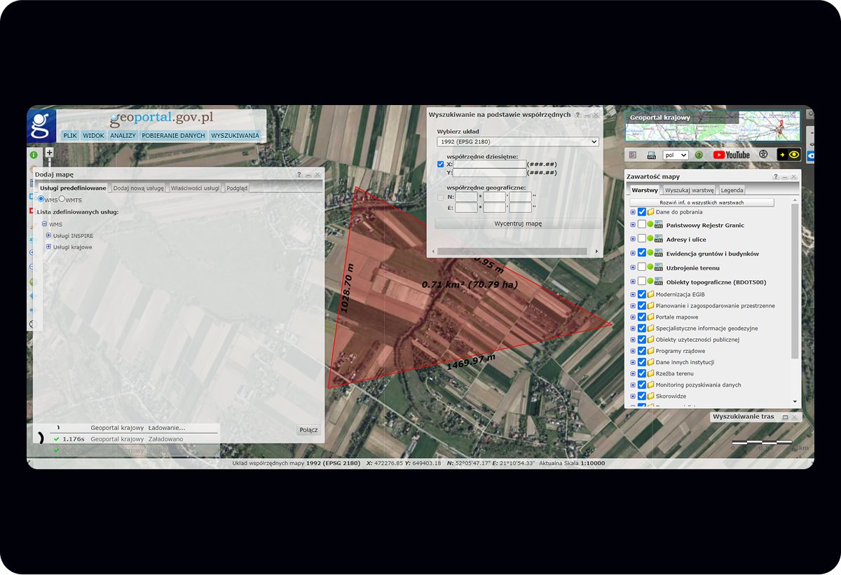
I began by conducting a comprehensive analysis of the existing Geoportal to identify its strengths and weaknesses:
Complex Interface
The existing interface was cluttered with tools and options, making it difficult for non-specialists to navigate. Critical functions were often hidden in nested menus or behind technical terminology.
Poor Visual Hierarchy
The design lacked clear visual hierarchy, with insufficient contrast between interactive and non-interactive elements. This made it difficult to identify primary actions and navigation paths.
Limited Responsiveness
The portal was primarily designed for desktop use, with poor adaptation to different screen sizes and devices, limiting accessibility for mobile users.
Valuable Data
Despite interface issues, the portal contained extremely valuable spatial data that was comprehensive and regularly updated—a significant strength to preserve and highlight.
Stakeholder Insights
Through interviews with GUGIK leadership and internal teams, I gathered key insights about priorities and constraints:
User Types & Needs
Government Officials
Need efficient access to accurate spatial data for planning and decision-making purposes
Urban Planners & Architects
Require detailed mapping and property information for professional projects
Citizens & Property Owners
Need simple access to property boundaries, zoning information, and local regulations
Researchers & Students
Access spatial data for academic and research purposes
Technical Requirements
- Must be built on Vaadin framework for consistency with other systems
- Need to maintain compatibility with existing backend systems
- Responsive design required for various devices and screen sizes
- Must meet WCAG 2.1 AA accessibility standards for public services
Key Research Takeaways
User Diversity Challenge
The system needs to serve both technical experts and ordinary citizens with varying levels of GIS knowledge.
Simplification Needed
Interface complexity was the biggest barrier to usability, requiring significant simplification without losing functionality.
Balance Institutional & User Needs
Success requires balancing government requirements with actual user needs for an effective public service.
Design Process
With a clear understanding of the challenges and constraints, I developed a comprehensive design approach to transform the Geoportal experience.
Information Architecture
Restructuring the portal's organization to improve navigation and feature discovery.
Wireframing
Creating low-fidelity designs to establish layout and functionality before visual design.
Visual Design
Developing a clean, professional interface with clear visual hierarchy and improved readability.
Implementation Support
Working with developers to ensure design was implemented accurately within technical constraints.
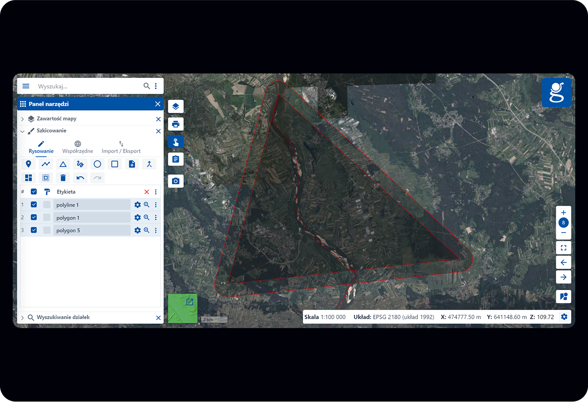
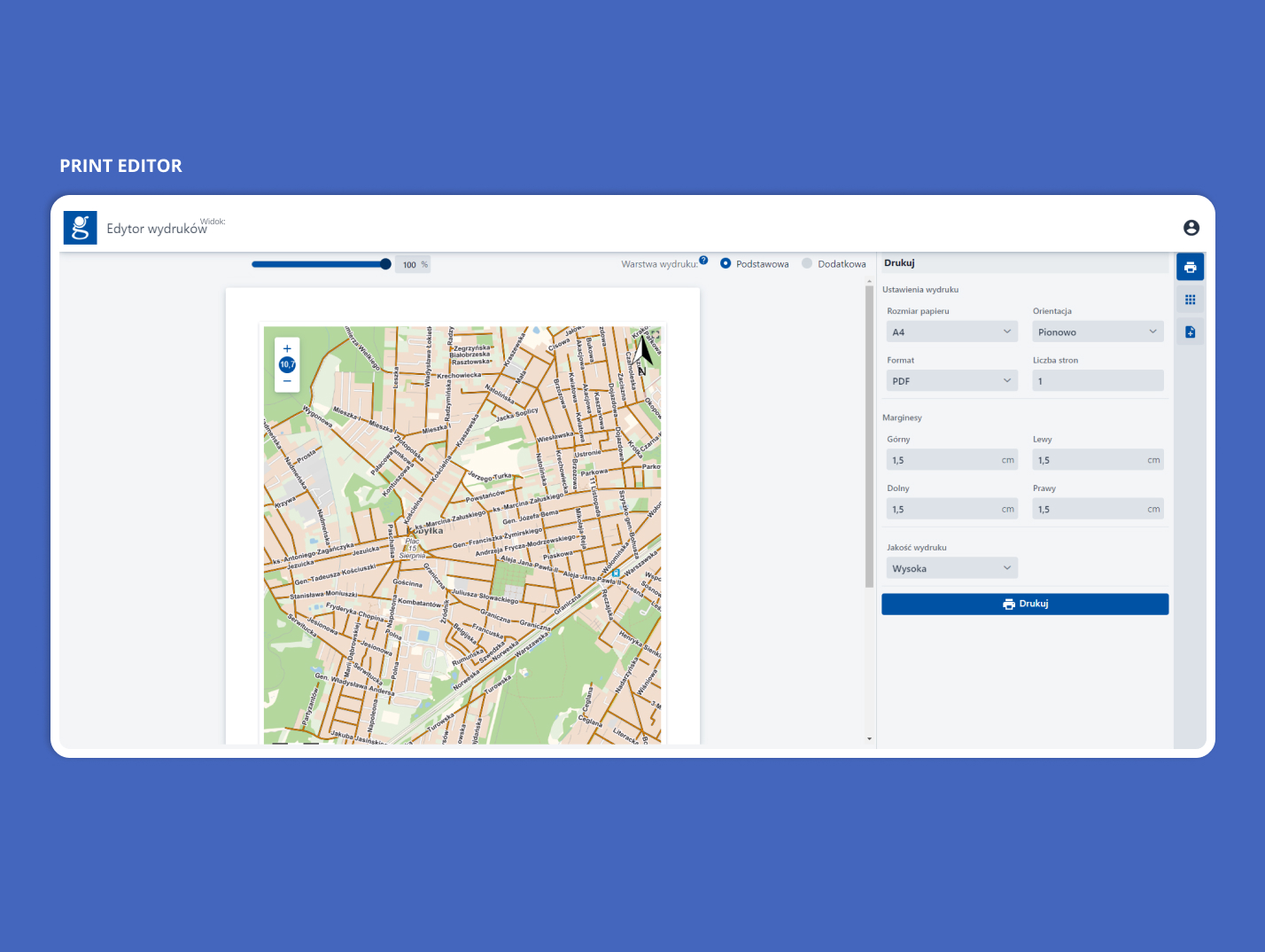
Design
The first step was to completely rethink how the Geoportal's features and tools were organized. Working with stakeholders, I created a new structure that balanced institutional requirements with improved usability.
Key Improvements
- Reorganized layout to achieve an orderly structure and ease of navigation
- Unified the display of tools for greater layout flexibility and easier switching between tools
- Simplified search by combining several tools into one and adding filters
- Redesigning and expanding a printing module that simplifies the daily work of people such as government officials, city planners and architects
- Adapting the solution to mobile devices to ensure full accessibility on all devices
The geoportal redesign project developed a new architecture and flexible layout, which became the basis for standardizing the company's tools. The solution proved so successful that it was implemented in five subsequent projects.
New layout gives more space to operate on the map
Before & After Comparison
A detailed look at how the redesign transformed key aspects of the Geoportal interface, improving usability and visual consistency while maintaining functionality.
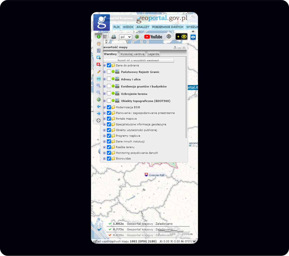
Key Issues
- Cluttered interface – multiple overlapping windows with no clear organization
- Lack of visual consistency – mismatched styles and system pop-ups break design coherence
- Poor readability – small fonts, outdated icons, and low contrast
- Scattered tools – key functions spread across separate windows, hard to locate
Key Improvements
- Modern, consistent design – unified color scheme, icons, and style
- Integrated tool panel – all functions accessible from one organized space
- Clear layout – logical hierarchy, collapsible sections, and better navigation
- Intuitive user experience – tools grouped by purpose, easy switching between functions
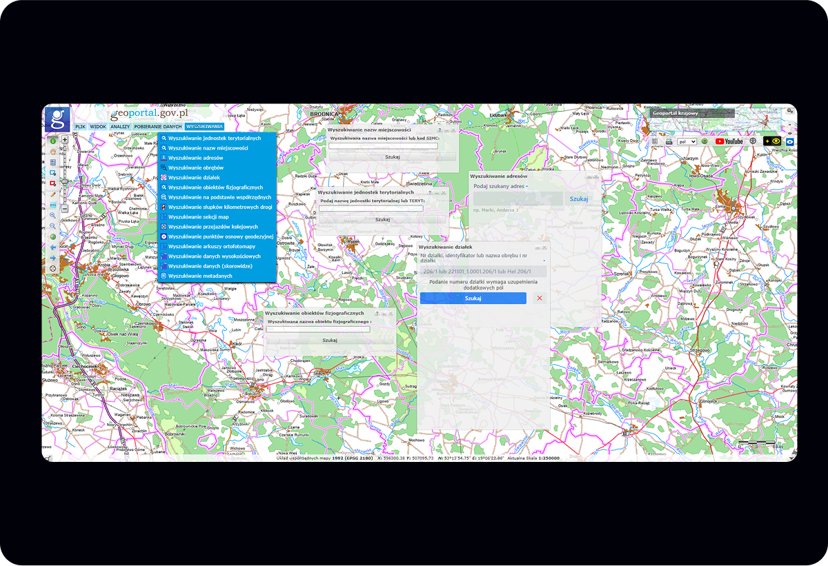
Key Issues
- Search engine divided into several windows in the form of tools
- Complicated navigation hidden in account settings
- Poor contrast making text difficult to read
- Lack of functional relationships between tools
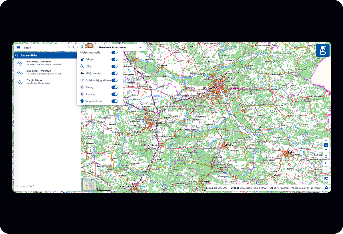
Key Improvements
- Direct access from main navigation
- High contrast text optimized
- Simplified search with combined tools and filters
- More space to work on the map
Key Issues
- No responsiveness - interface not adapted to different screen sizes
- Poor touch optimization with tiny controls
- Limited functionality on mobile devices
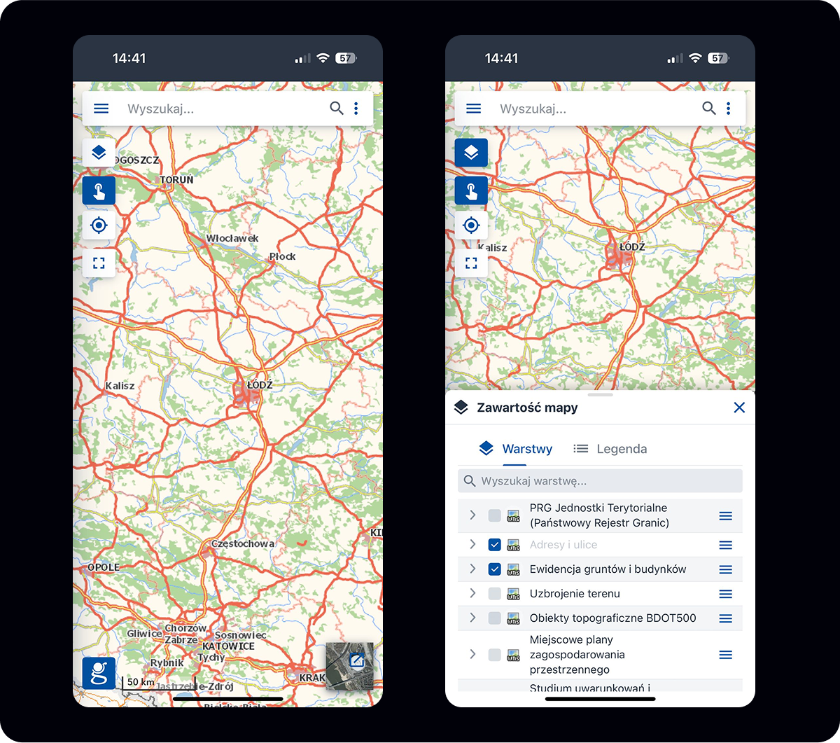
Key Improvements
- Fully responsive design optimized for all screen sizes
- Touch-friendly controls and gestures
- Complete functionality preserved on mobile
Visual Design System
I used and adapted the ready-made Vaadin design system. The specific nature of the product required the creation of additional components in collaboration with programmers.
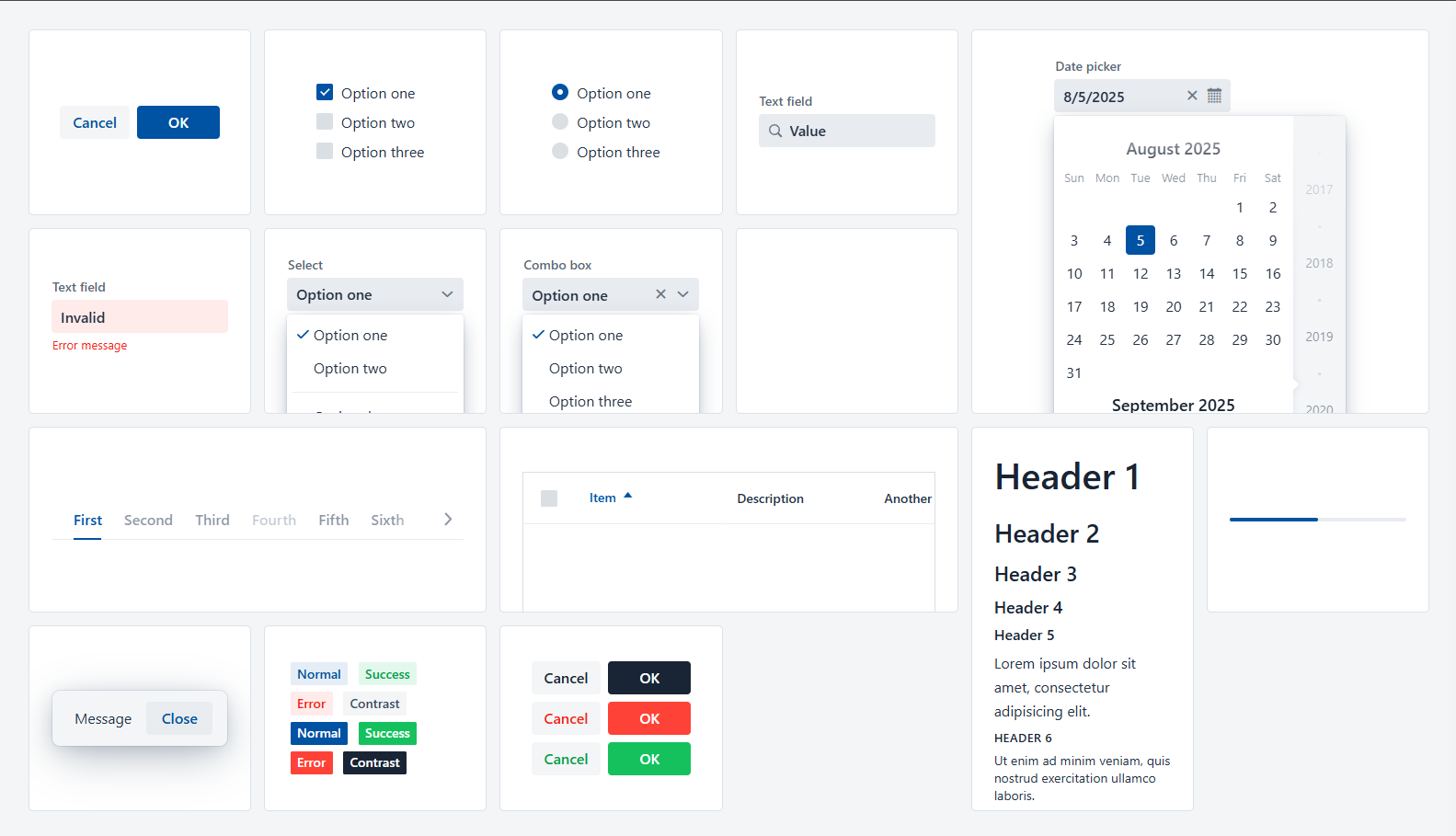
Vaadin Lumo theme editor
Solution & Outcomes
The final design solution transformed the National Geoportal into an intuitive, accessible platform. The geoportal redesign introduced a new information architecture and flexible layout, which defined a standard for presenting the company's tools. Thanks to its thoughtful structure and proven effectiveness, the solution was adopted in five subsequent projects.
Final Design
Key Features
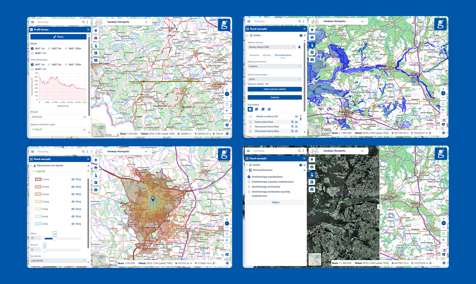
User-friendly access to tools for everyone
The application provides a wide range of free features. All functionalities are designed to be intuitive, making it easy and natural to learn new capabilities.
- Easy-to-use measurement tools
- Advanced spatial analyses
- Data visualization on maps
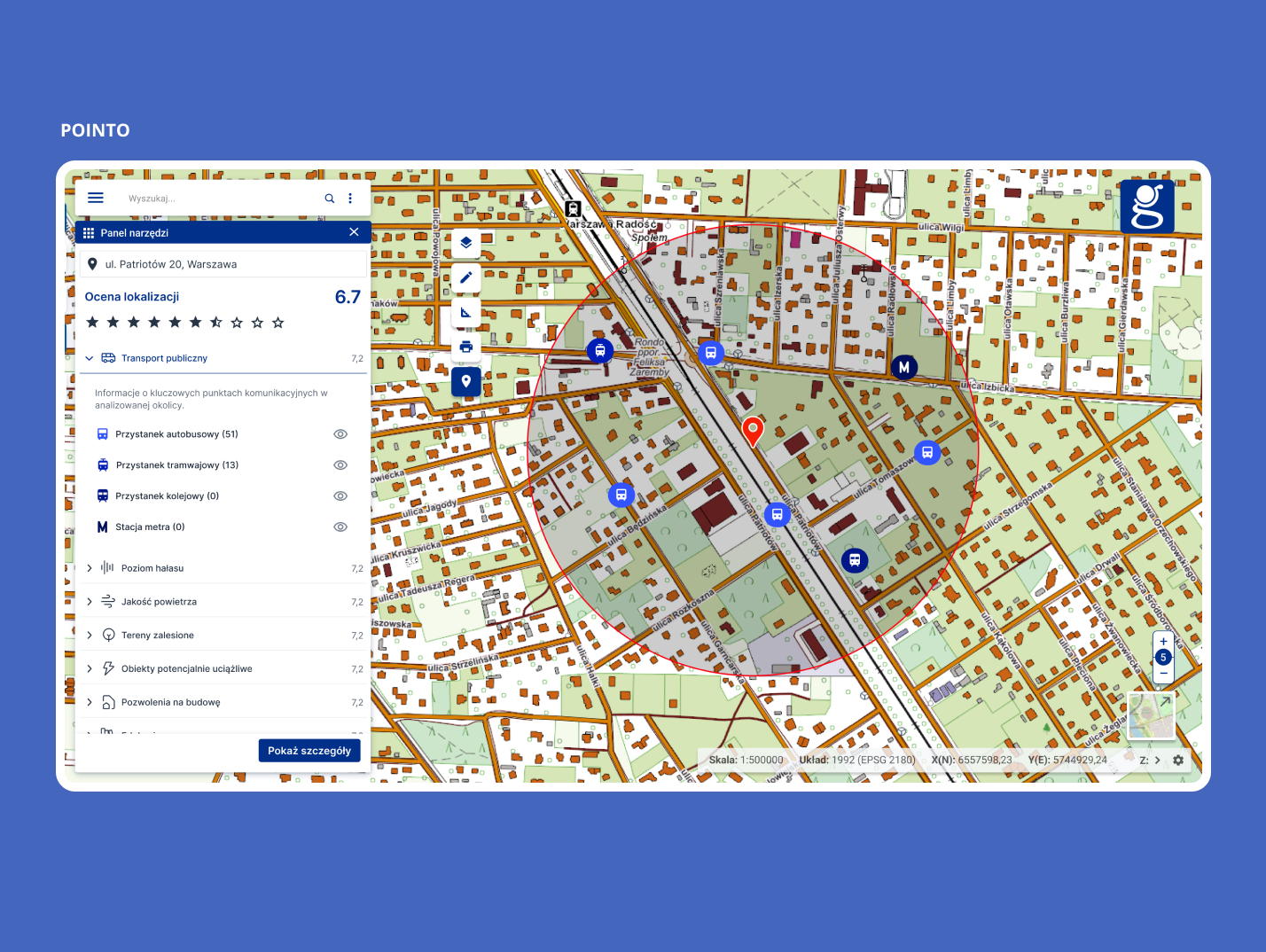
Search Engine Unification
Integration of multiple search tools into a single interface enables faster and more efficient information retrieval.
- Unified search interface with integrated filters
- Consolidated results display with categorization
- Streamlined address and cadastral number search
Simplified Tool Management
The new tool format makes it easier to manage and use multiple tools on the map, while keeping the view organized
- Centralized tool management in one place
- High display responsiveness for smooth operation
- Tool widget design adapted to mobile devices
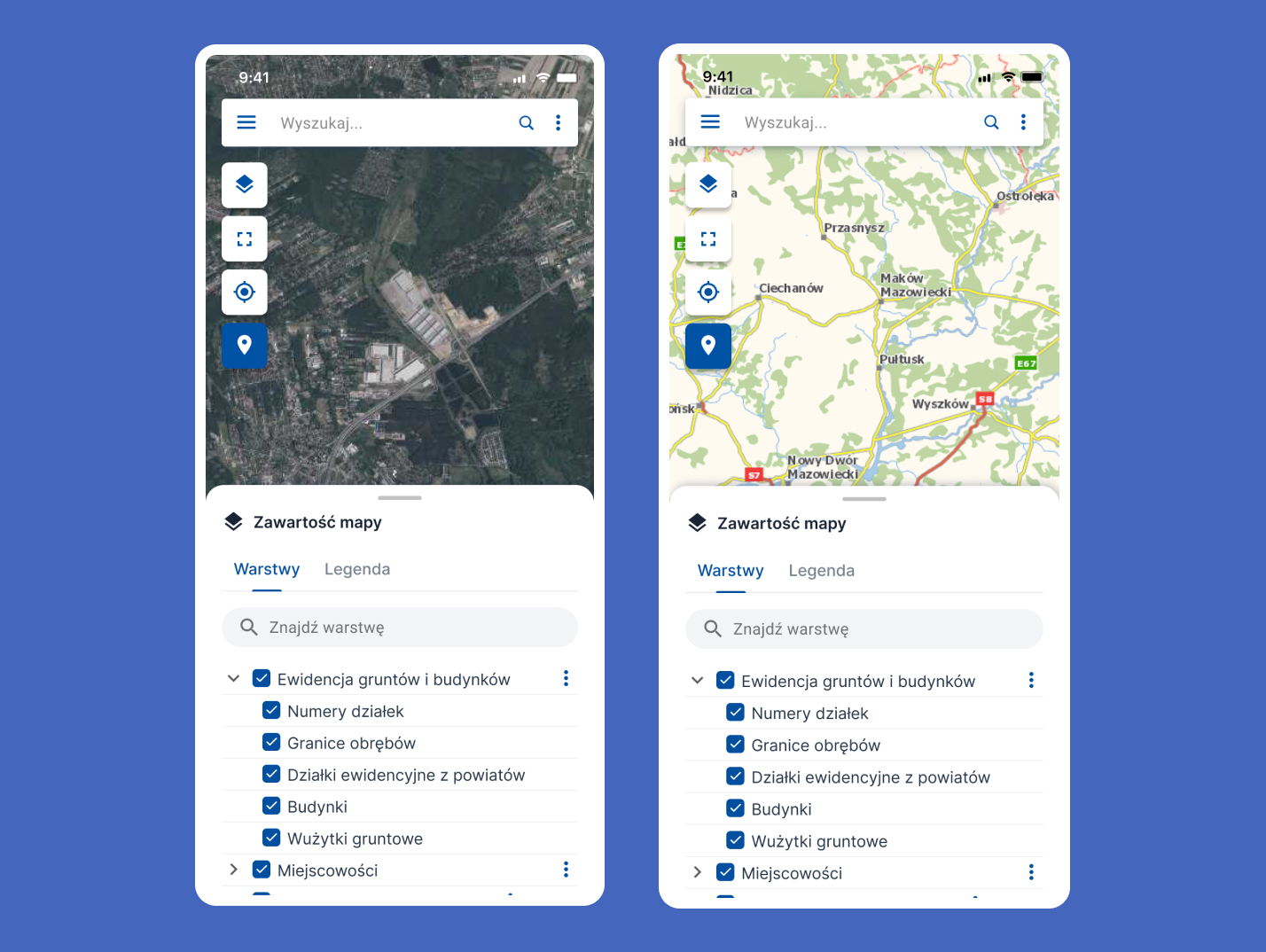
Responsive Design
The portal now works seamlessly across desktop, tablet, and mobile devices, expanding access to spatial data.
- Optimized layouts for different screen sizes
- Touch-friendly controls for mobile users
- Offline capabilities for field work
Lessons Learned
Simplification Adds Long-term Value
The streamlined tool panel not only improved the Geoportal's interface but also proved to be a versatile solution, leading to its implementation across five additional projects. This demonstrated how thoughtful simplification can create lasting value beyond the initial scope.
Continuity Enhances User Experience
Enabling multiple tools to remain open simultaneously eliminated the frustration of losing work progress when switching between functions. This seemingly simple feature significantly improved user workflow and satisfaction.
Familiar Patterns Ease Adoption
By incorporating familiar elements from the previous version, such as modal windows and right-side docking, we minimized the learning curve for existing users while introducing improvements. This balance of old and new helped ensure a smooth transition to the updated system.
Scalable and Lightweight Layout
A minimalist structure made the panel mobile-friendly and compatible with standard company tools, without requiring extra development effort.
Missing User Research as a Limitation
While the project met business goals, the lack of user testing limited alignment with real needs. This underlined the importance of including research in future design processes.
Next Project
Virtual River Guide
Modernizing the outdated, paper-based vessel passage system through water locks on Poland's waterways with a comprehensive digital solution.
View Case Study