Car Configurator App Case Study

Independent Project

Car Configurator App

Creating an intuitive and engaging mobile experience for automotive customers to customize their dream vehicles.

Client

Project to portfolio

Timeline

2022/23

My Role

End-to-end Product Designer

Project Overview

As a personal project, I took on the challenge of reimagining how a car configurator could work on mobile devices. After observing the complexity and poor user experience of existing configurators, I saw an opportunity to create something more intuitive and engaging.

My goal was to design a mobile-first experience that would make vehicle customization simpler and more enjoyable, while helping users make confident decisions about their dream car configuration.

Project Goals

  • Create a solution that enables informed decision-making based on reliable and standardized information
  • Simplify the car configuration process through an intuitive mobile interface
  • Increase user engagement
  • Boost quote requests and dealer appointment bookings
  • Create a visually appealing experience that showcases vehicles effectively
  • Ensure a responsive design optimized for various mobile devices

Project Scope & Process

  • Research and Concept

    Collecting and analyzing secondary data, determining target groups, and developing main project assumptions.

  • User Research

    Establishing criteria, conducting surveys, observing user behavior, and interviewing automotive enthusiasts to understand their needs.

  • Competitor Analysis

    Analyzing various configurators from several car brands to identify their strengths and weaknesses.

  • UX Strategy

    Analyzing user needs, setting goals, developing design solutions. Creating personas, empathy maps, user flows, and information architecture.

  • UI Design

    Designing the look and feel of the application, starting with sketches and moving on to high-fidelity mockups.

  • Usability Testing

    Iterative testing sessions were conducted to verify design decisions and identify areas for improvement.

Current Industry Problems

Analysis of existing automotive websites revealed several critical issues that negatively impact user experience and conversion rates.

Information Overload

Product pages are cluttered with banners, videos, and marketing descriptions, making it difficult to find relevant information.

Common Problems

  • Excessive number of advertising banners distracting the user's attention
  • Technical specifications presented without context
  • Overloading the page with unnecessary content

Poor Mobile Experience

Most configurators are designed for desktop first, with mobile experiences feeling like an afterthought.

Key Problems

  • Non-responsive layouts breaking on mobile devices
  • Touch interactions not properly optimized
  • Long loading times for 3D models and images

Inconsistent Experience

Significant differences in the presentation of content and functionality between different model pages and their configurator within the same brand website.

Impact on Users

  • Confusing navigation between different model pages
  • Inconsistent feature presentation across models
  • Varying levels of information detail

Misaligned Conversion Strategy

Call-to-action points and conversion funnels not optimized for different user segments and their needs.

Common Mistakes

  • Long and mismatched contact form
  • Request for sensitive data without justification
  • Poor timing of conversion prompts

Research & Discovery

We began with comprehensive research to understand user needs, pain points, and expectations when configuring vehicles on mobile devices.

Buyer Demographics

  • Age Range: 35-55 years

    Established professionals in their peak earning years, with stable career paths and family commitments

  • Income: >7,000 PLN net monthly

    High-income segment with significant disposable income and investment capability

  • Long-term Ownership Focus

    Values quality and durability, typically keeps vehicles for 5+ years

  • Tech-Savvy Consumers

    Comfortable with digital tools and expects modern shopping experiences

User Research

I gathered information through online communities, user interviews, and behavioral analysis.

Key User Insights

"It seems like this car could be designed in many different ways, but I can't fully take advantage of that because I don't understand it."

"Which package offers what I need and is reasonably priced? I would like to be able to compare them."

"I feel tired. I have to memorize descriptions, jump between sections, and compare. I have to figure out for myself what is changing and why."

Target User Characteristics

Our primary users are established professionals who prioritize:

  • Reliability

    Seek assured technical condition and manufacturer warranty

  • Long-term Value

    Plan for extended ownership and quality investment

  • Financial Stability

    Have means for premium vehicle investment

  • Service Quality

    Value professional support and service

User Pain Points

  • Overly complex configuration process causing confusion and drop-offs
  • Lack of clear information about differences between trim levels
  • Difficulty navigating and comparing options on mobile devices
  • Inadequate visual feedback when making configuration changes
  • Frustration with saving and retrieving configurations

Competitive Analysis

I analyzed mobile configurators from various automotive brands to identify pain points, best practices, and opportunities for innovation in the user experience.

Strengths to Adopt

  • 360° visualization of vehicle configurations
  • Step-by-step guided process with progress indicators
  • Real-time price updates as options are selected
  • Package recommendations based on selected features

Gaps to Address

  • Poor explanation of feature benefits and differences between options
  • Limited configuration comparison capabilities
  • Hidden costs revealed late in the configuration process
  • Cumbersome navigation between configuration stages
  • Inconsistent presentation of content and information

User Personas

Katarzyna
Katarzyna, 52

B2B Methodology Director

Hard-working and practical professional focused on finding transparent purchase options and quick vehicle access.

Challenges with pricing transparency and technical jargon
Seeks streamlined analysis and test drive arrangement
Nikodem
Nikodem, 25

Data Developer

Tech-savvy professional looking for innovative features and digital integration in vehicle configuration.

Values technical specifications and smart features
Expects seamless digital experience

Key Research Takeaways

Streamlined Process

Users need a clear, step-by-step configuration process with the ability to easily navigate between sections.

Visual Feedback

Immediate visual representation of configuration changes is crucial for user engagement and decision-making.

Contextual Information

Users need clear explanations of features and differences between options to make informed decisions.
Design Process

Based on our research findings, we developed a comprehensive design approach to create an intuitive and engaging car configuration experience.

1

User Flow Design

Creating a logical, step-by-step process for vehicle configuration.

2

Wireframing

Developing low-fidelity layouts to establish core functionality.

3

Visual Design

Creating high-fidelity designs with brand-aligned aesthetics.

4

Prototyping & Testing

Validating designs through interactive prototypes and user testing.

User Experience Strategy

The interface design focuses on emotional engagement and intuitive navigation. A persistent view of the configured vehicle enhances visual impact, while the menu structure supports both linear flow and flexible user control.

Key Design Decisions

  • Persistent Vehicle Preview

    The car model remains visible throughout the process, providing immediate visual feedback for all customizations

  • Progressive Disclosure

    Key technical data shown first; users can explore more details as needed, reducing cognitive load

  • Logical and Flexible Flow

    Users can follow a linear path or freely jump between sections, accommodating different shopping styles

  • Prioritized Configuration Steps

    Flow reflects user priorities: engine → design → comfort, matching natural decision-making process

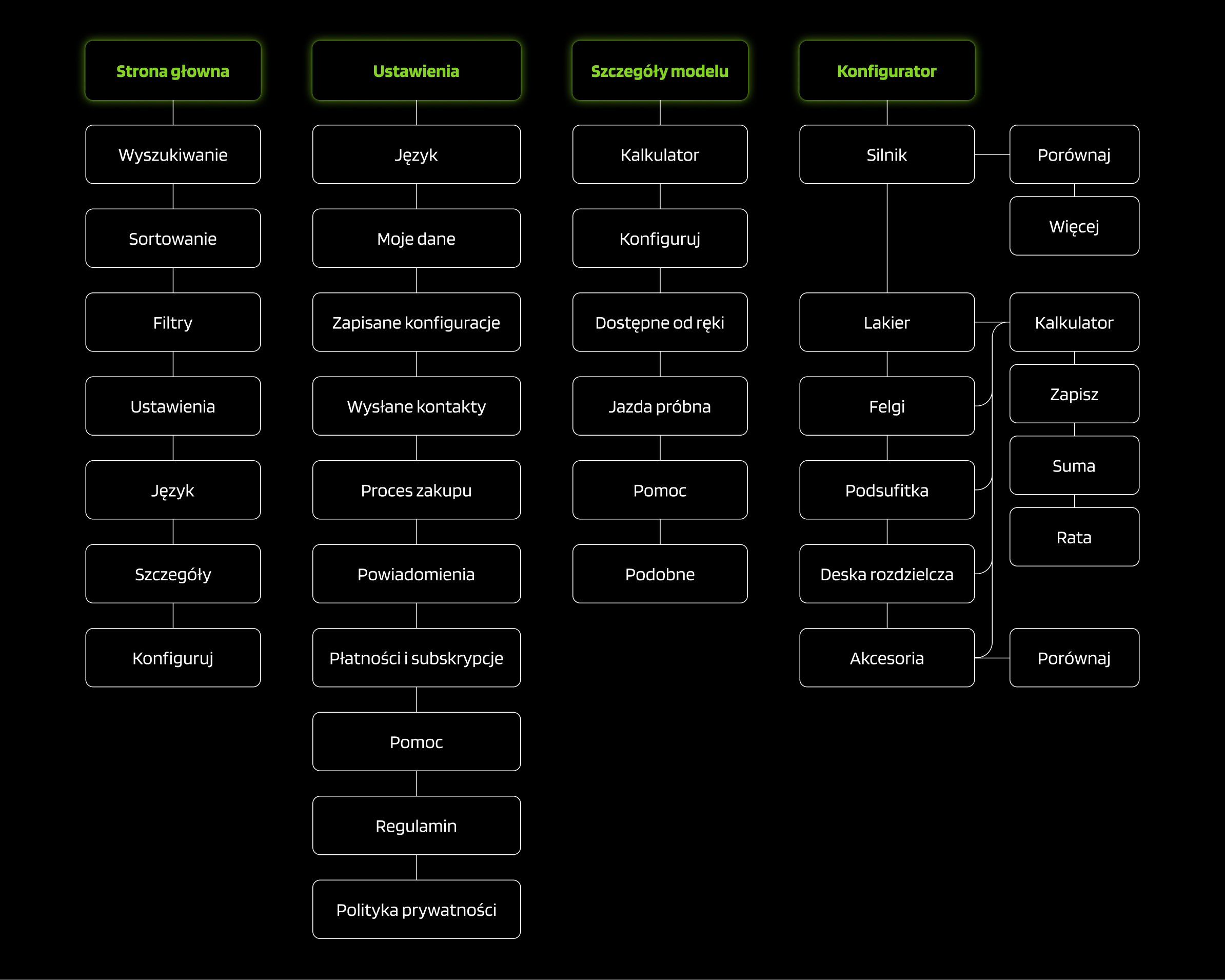
  • Simplified Information Architecture

    Only four main sections; minimal navigation and no unnecessary nesting to maintain clarity

User Flow Diagram

Information architecture diagram

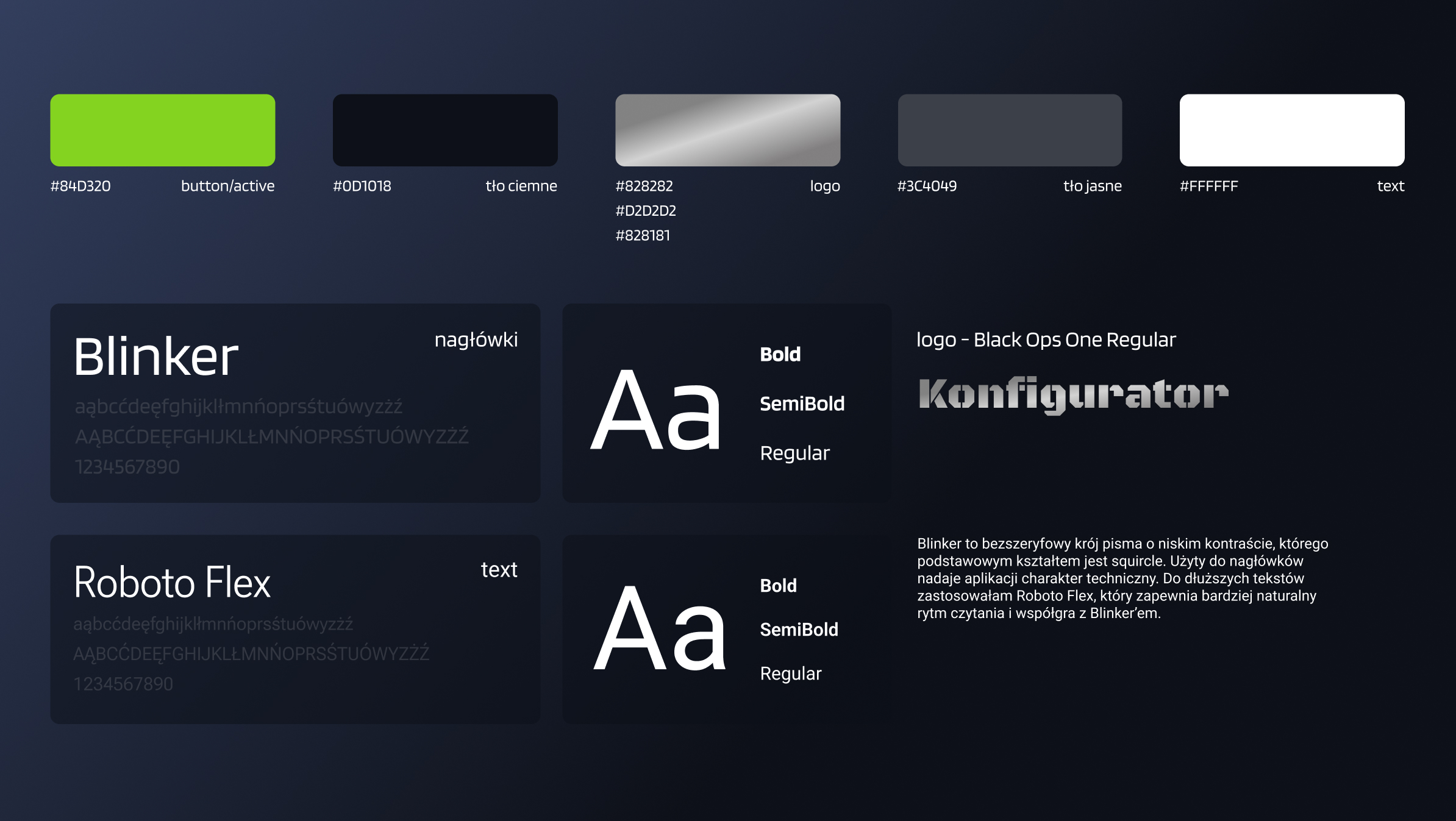
Visual Design System

I have developed a comprehensive design system that is visually appealing and distinctive, while also providing a high-quality, intuitive mobile experience.

Design System in Figma

Design system documentation in Figma showing color palette, typography, and component library

Key User Testing Insights

User Types & Behavior

Two distinct user groups emerged during testing: Group A prioritized aesthetics and performance, while Group B focused on technical specifications and features. Both groups showed high engagement with comparison tools.

Key Observations:
  • Both groups actively used comparison features
  • Price remained a primary decision factor across groups

Navigation & Flow

Users expressed uncertainty about the configuration process length and felt restricted in moving between sections. Implementation of progress indicators and navigation improvements significantly enhanced the experience.

Solutions Implemented:
  • Added clear progress bar showing total steps
  • Implemented prominent "Next" button with step preview

Layout & Screen Orientation

Improved option grouping enhanced readability. All users rotated their devices to landscape mode after prompting, but vertical orientation remained unused.

Design Decisions:
  • Optimized layout for landscape viewing
  • Reorganized options into logical groups

Before & After Iterations

Before Design
Before

Original Design

  • No cross-section navigation between configuration steps
  • Unclear visibility of total configuration stages
  • Hidden 3D view mode toggle for day/night visualization
  • Selected engine details not persistent across steps
  • Overwhelming interface with poor information hierarchy
After Design
After

Improved Design

  • Enhanced navigation with prominent "Next" button and cross-section movement
  • Clear progress indicator showing configuration stages
  • Unified view controls combining day/night and interior/exterior toggles
  • Persistent display of selected engine version across all steps
  • Streamlined interface with improved information hierarchy

Final Solution

After multiple iterations based on user testing, we delivered a refined car configurator app that met both user needs and business objectives.

Final Application Design

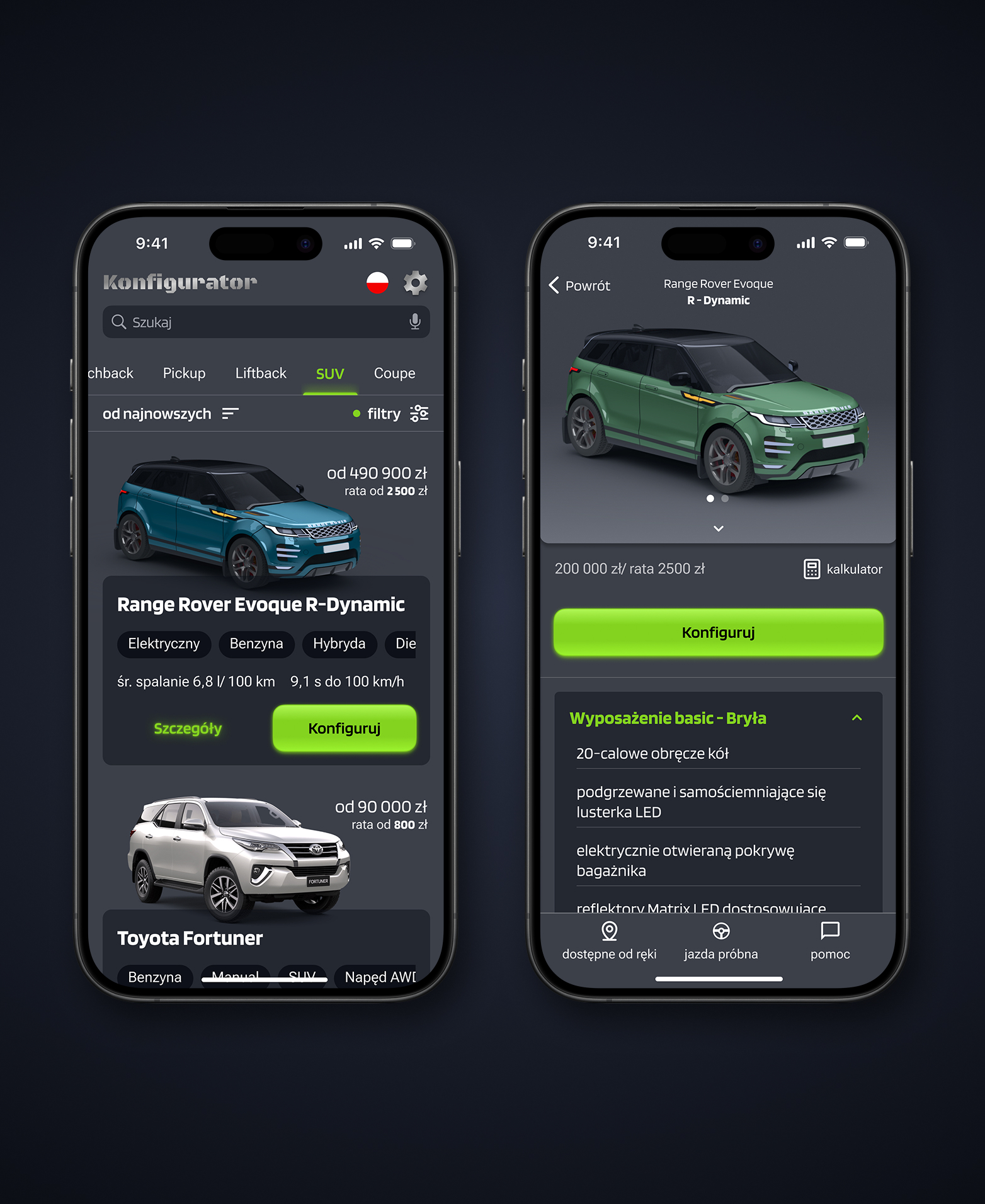
Model Selection Screen

Standardized Content Structure

Unified information architecture ensures quick and intuitive access to relevant data.

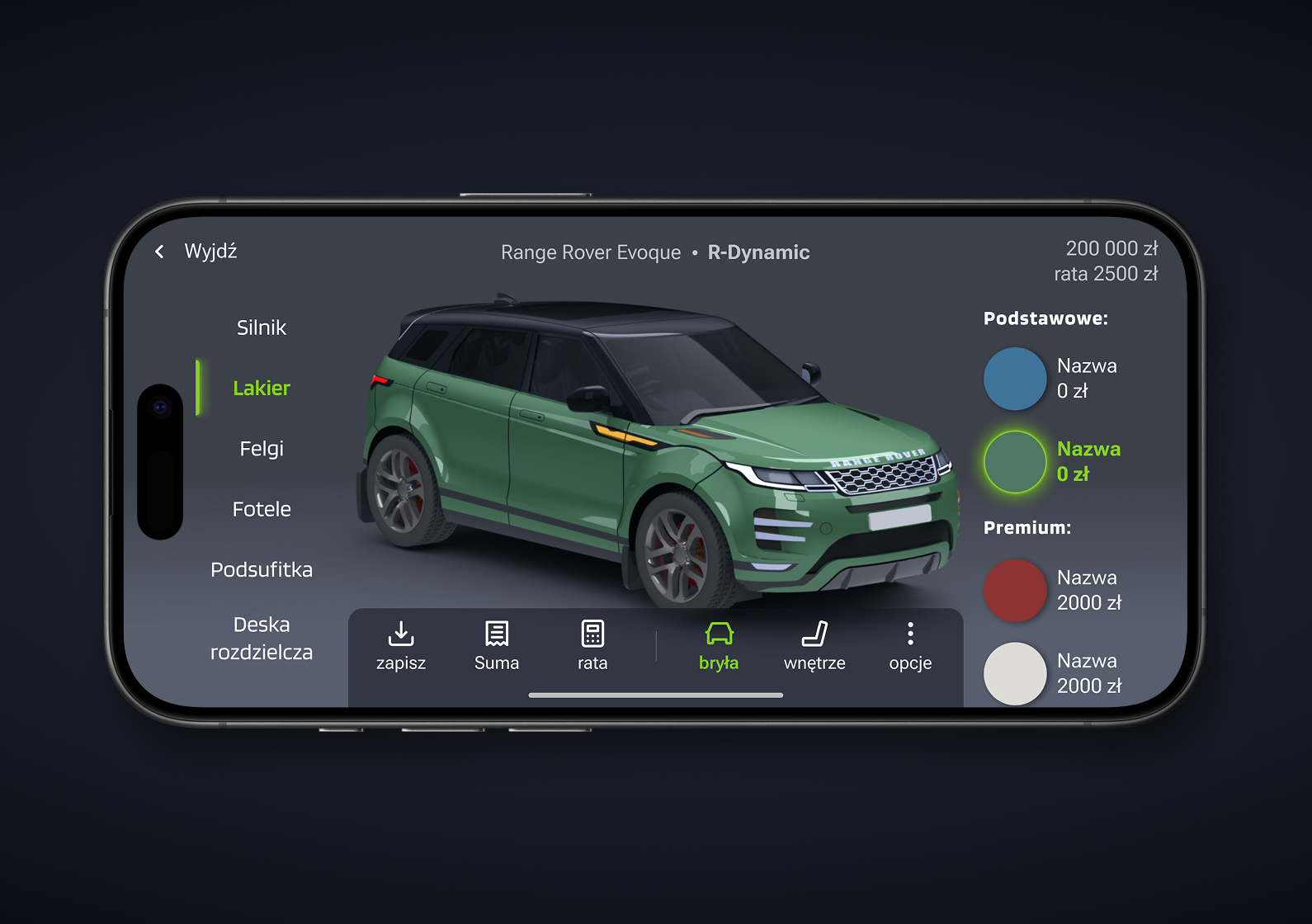
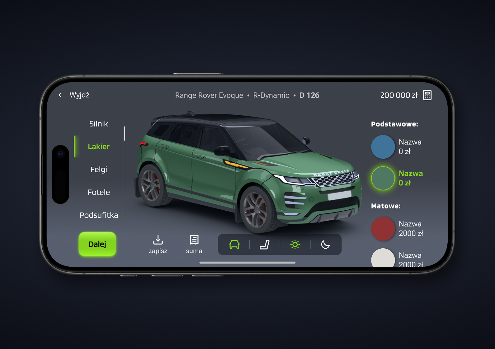
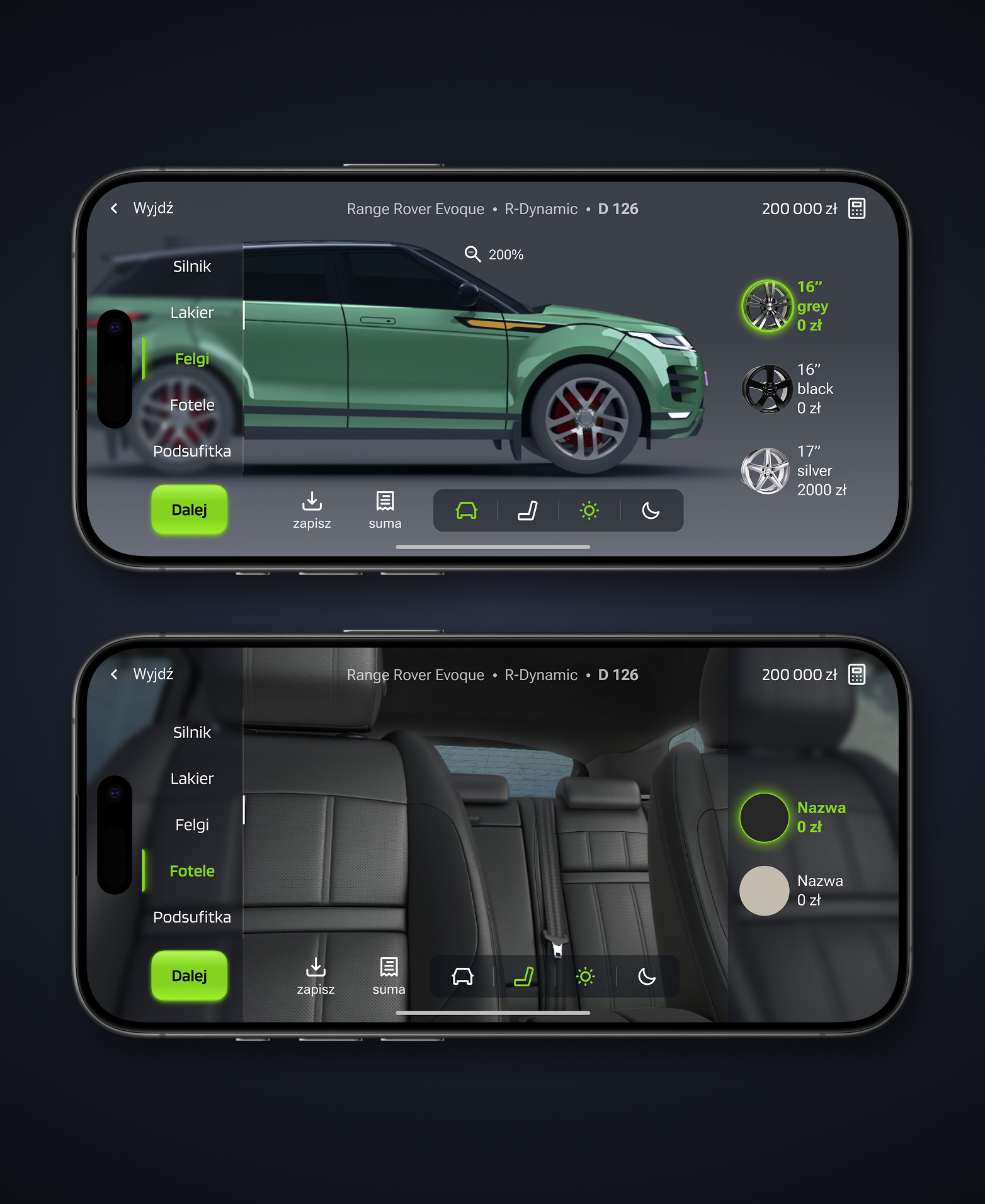
Exterior Customization Screen

Optimized Screen Usage

The 3D car view maximizes screen space to clearly reflect configuration changes in real time.

Interior Customization Screen

In-Process Comparison

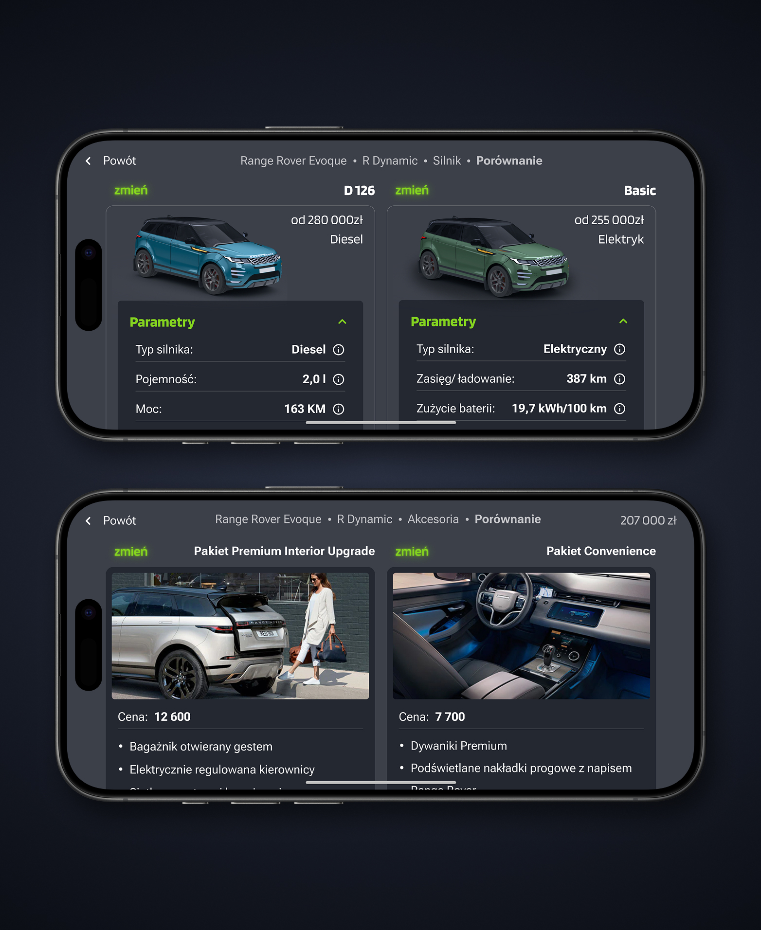
Users can compare engine versions, equipment packages, and saved configurations seamlessly.

Package Selection Screen

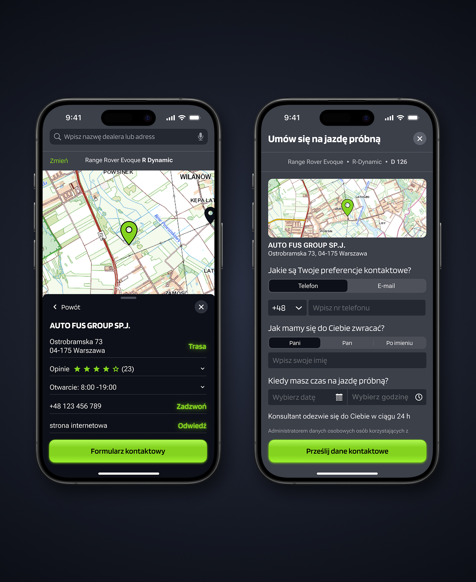
Test Drive Scheduling

Key info is clearly presented; multiple contact options and an engaging, user-friendly form boost conversion. CTA placed at critical moments (end of config & model details).

Key Features

Interactive 3D Visualization

Real-time 3D model that updates instantly with user selections, allowing 360° rotation and zoom.

  • Gesture-based rotation and zoom
  • Real-time updates for all customizations
  • Interior view toggle

Information Presentation & Control

Clear content organization and progressive disclosure give users control over what and when they see technical data.

  • Only essential specs shown by default, with the option to expand
  • Advanced filters & search functionality
  • Tooltips for technical terms and specifications

Comparison

Displaying comparisons in mobile landscape view improves readability by aligning key information side by side.

  • Side-by-side visual comparison
  • Highlighting differences in features and prices
  • Saving and comparing different configurations

Lessons Learned

This project provided valuable insights that will inform future design work for complex mobile applications.

Clear Guidance Is Essential

Even tech-savvy users need clear, contextual guidance when interacting with complex 3D interfaces on mobile. Visual hints and improved usability significantly enhanced user experience.

Next time: I'll prioritize leading users more intentionally rather than assuming they'll discover functionality on their own.

Balancing Complexity and Simplicity

The challenge wasn't to remove complexity, but to make it accessible. Users wanted full control and information — but delivered in a digestible format.

"One of the key design decisions is the trade-off between features and simplicity."

- Jakob Nielsen

Progressive disclosure and contextual information proved highly effective in simplifying decision-making without overwhelming users. This balance is especially critical on product detail pages.

Smart Research Saves Time

Early research and competitor analysis helped anticipate user needs and reduced the number of iterations required later in the design process.

By thoroughly understanding the market and user needs upfront, I was able to make more informed design decisions from the start.

Next Project Preview
Independent Project

InPost Loyalty Program Redesign

Reimagining the rewards experience to increase user engagement and program participation

View Case Study